SEPI
The Society for the Exploration of Psychotherapy Integration — an international academic society founded in 1983, with members in more than 30 countries. Their site had not been rethought in years, and it was costing them at the exact moments that mattered: a conference to fill, a journal to sell, and members to sign up.
- BuiltSeptember 2026
- ScopeFull public site, 11 pages
- KeptEvery word, every photo


Four things that were costing them
The EVENTS menu led to a dead end
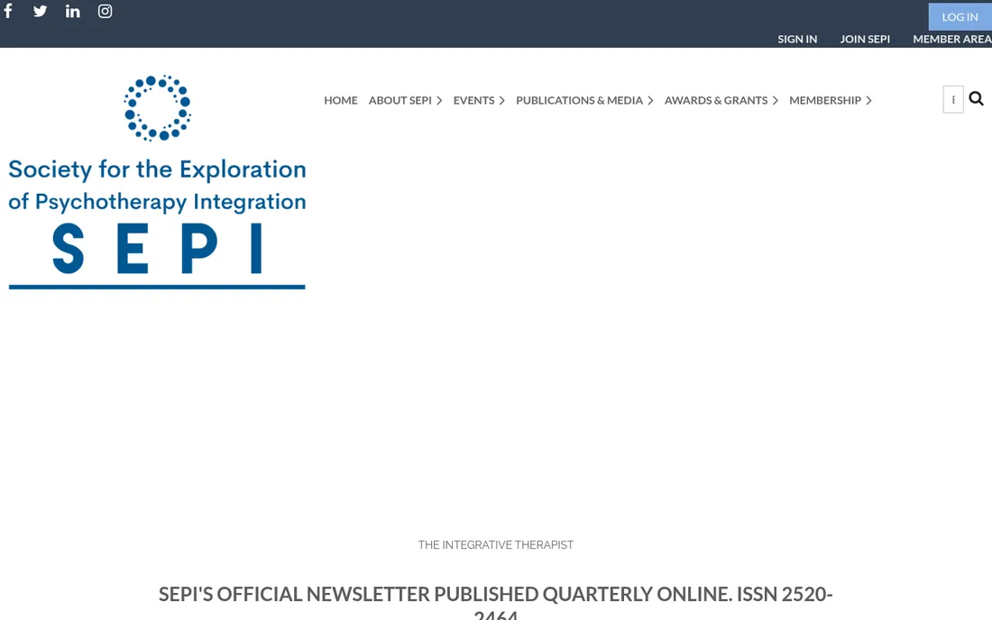
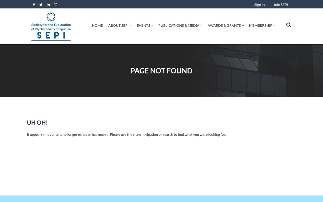
Their top-level EVENTS link redirected to “UH OH! It appears this content no longer exists.” For a society whose whole year builds to one international conference, that is the worst possible link to lose. Three more were dead alongside it.
Now: the conference has its own page — dates, venue, call for papers and registration, with the next meeting stated on the home page before you scroll.

Seven committees, one long scroll
Officers, advisors and seven committees were spread across nine near-identical pages, each one a stack of stock-photo banners and left-aligned portraits. Finding who chairs Research meant knowing the page existed first.
Now: one People page with every group a tab away, portraits on a single grid, and a profile that opens in place. The same names, the same words — reachable in one click instead of five.


On a phone, it was the desktop site shrunk
The old site put its logo block above everything, so the first screen on a phone was a logo and white space — no headline, no conference, nothing to do. Most people arrive this way.
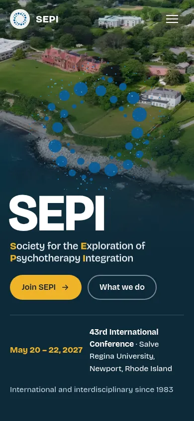
Now: the phone gets its own layout. The society's name, what it is and the next conference all land on the first screen, and the menu is one thumb-reach away.

Their best material was buried
Forty-three newsletter issues, twenty-one teaching syllabi, the journal, the awards and the regional networks were all real assets — listed as plain blue links down a page, indistinguishable from each other.
Now: publications, awards and networks each get a page that looks like something worth reading, with the archive intact and every original PDF still one click away.